
A fresh start for international students

DAAD - my guide
New UX concept for a public sector platform

The Challenge
How can we turn a complex public service platform into an intuitive, welcoming experience for a young, international audience?
The DAAD (German Academic Exchange Service) supports thousands of prospective students each year in finding the right study program in Germany. At the heart of that experience is myguide.de- a platform offering access to degree programs, institutions, and application support.
They asked us to rethink on a concept level the starting point of the platform – its homepage – to create an intuitive an engaging experience.
The Solution
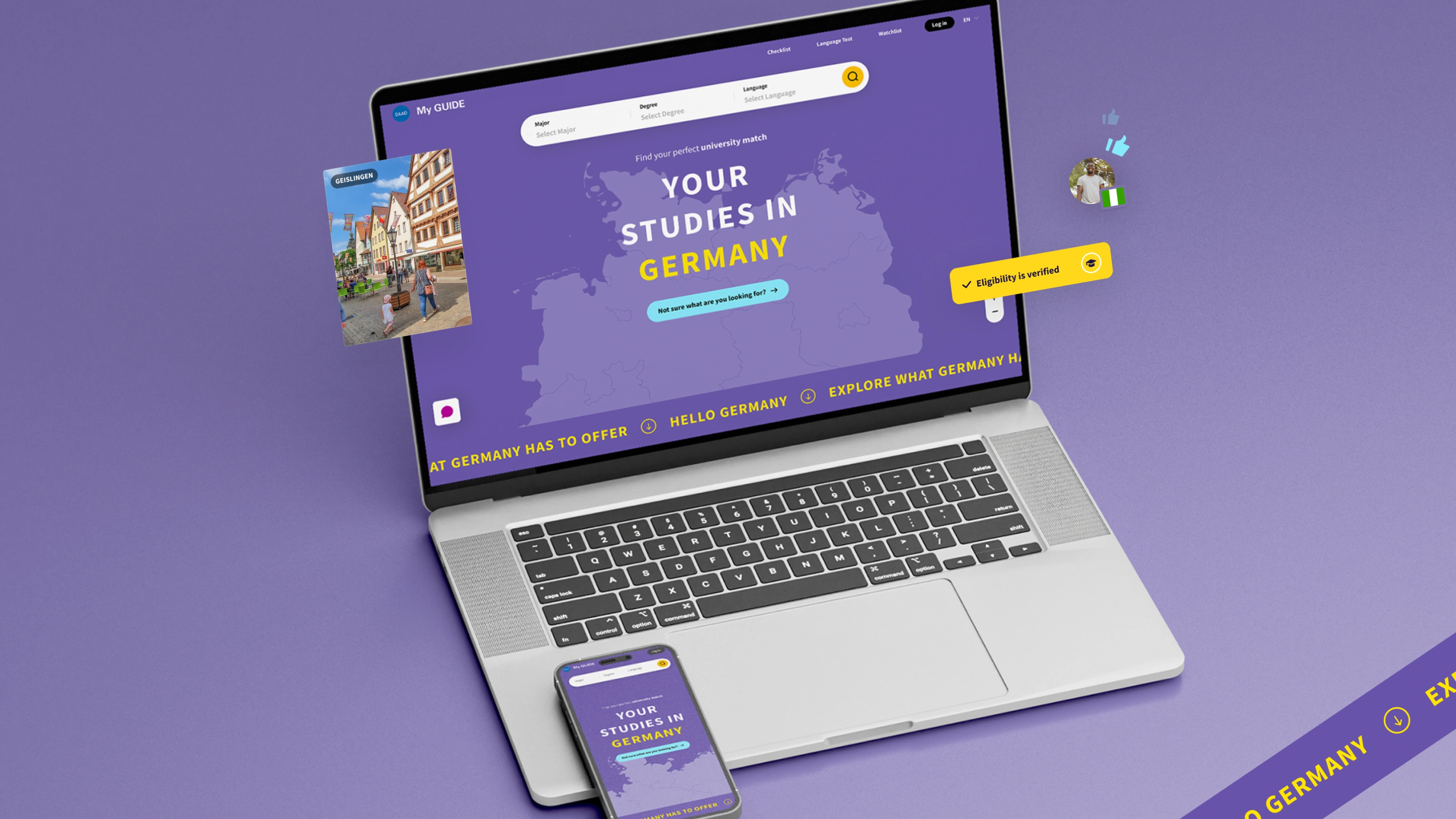
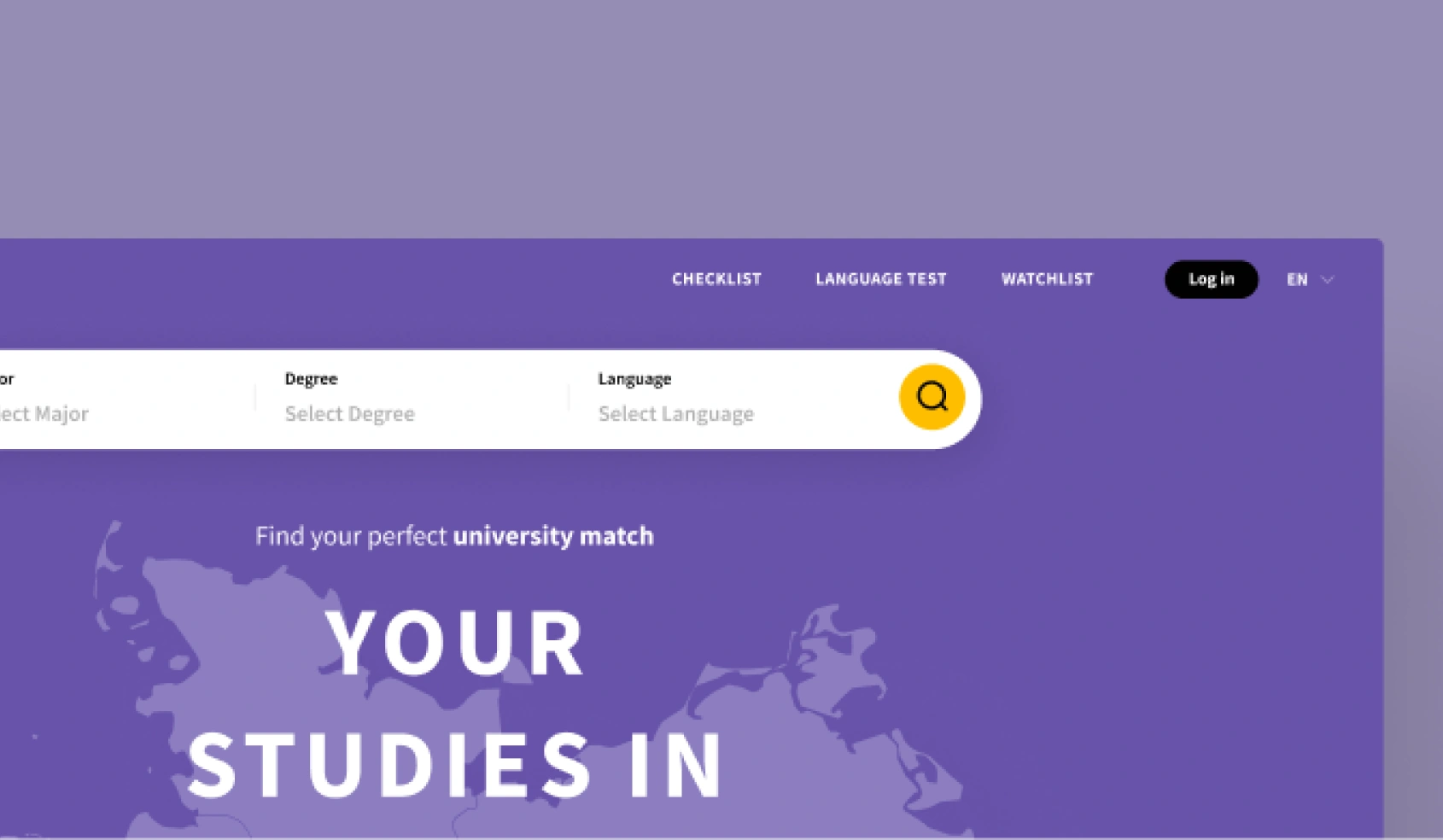
The result is a clear, visual, and interactive homepage experience that rethinks how students start their journey to study in Germany. Structured, modern, and emotionally resonant, the concept is inspired by the “Hello Germany” campaign and built with accessibility and clarity at its core. The new homepage experience helps turn complexity into a clear and guided journey.
The goal was to make the full range of DAAD services more accessible, clearly structured, and emotionally engaging - all while staying true to the campaign language of “Hello Germany.”

Rethinking existing offering
We began by analyzing the platform’s existing functions. We felt the offering was strong, but navigation and interaction patterns were holding users back. Based on our analysis and design principles, we created a new landing experience that makes myguide.de more navigable and user-focused from the first click.
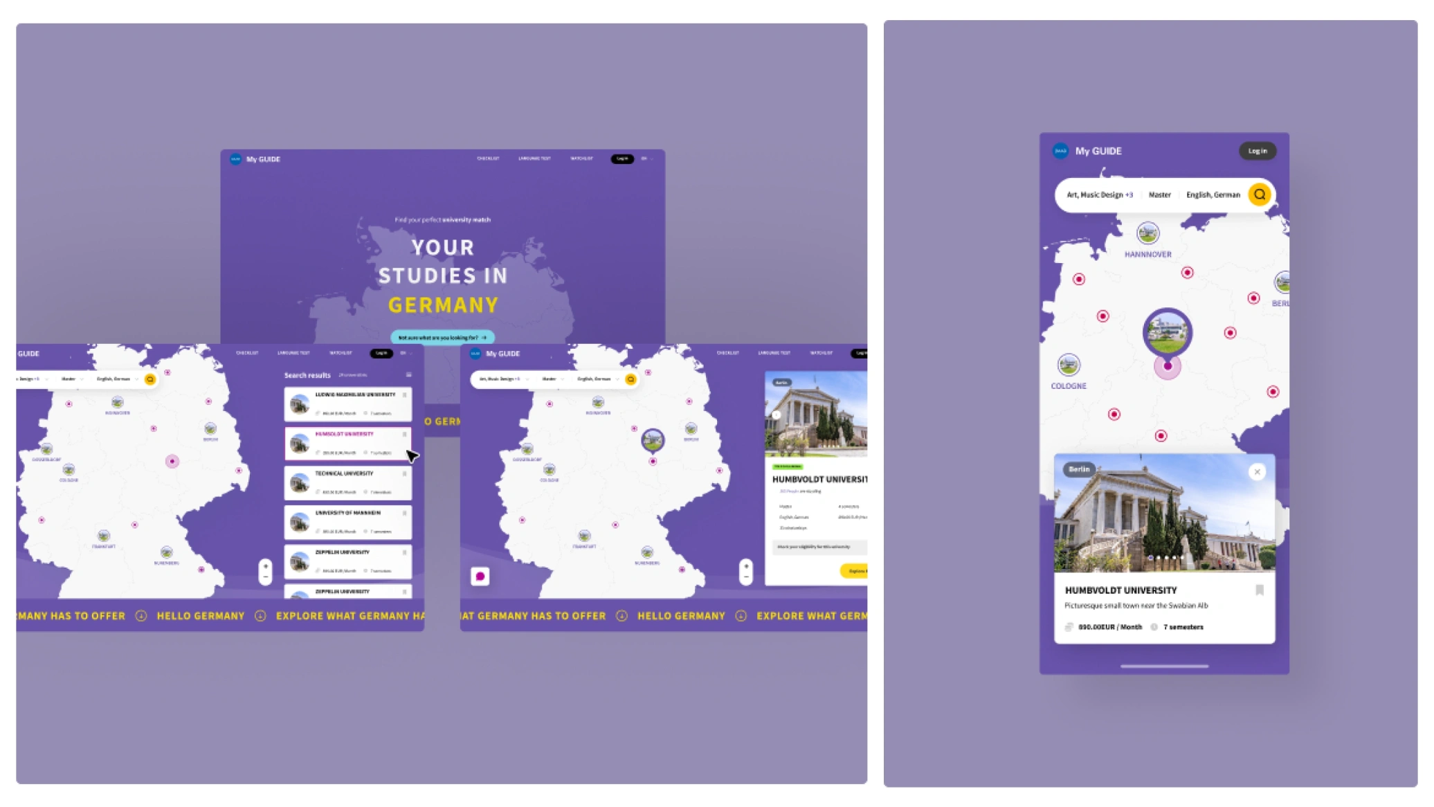
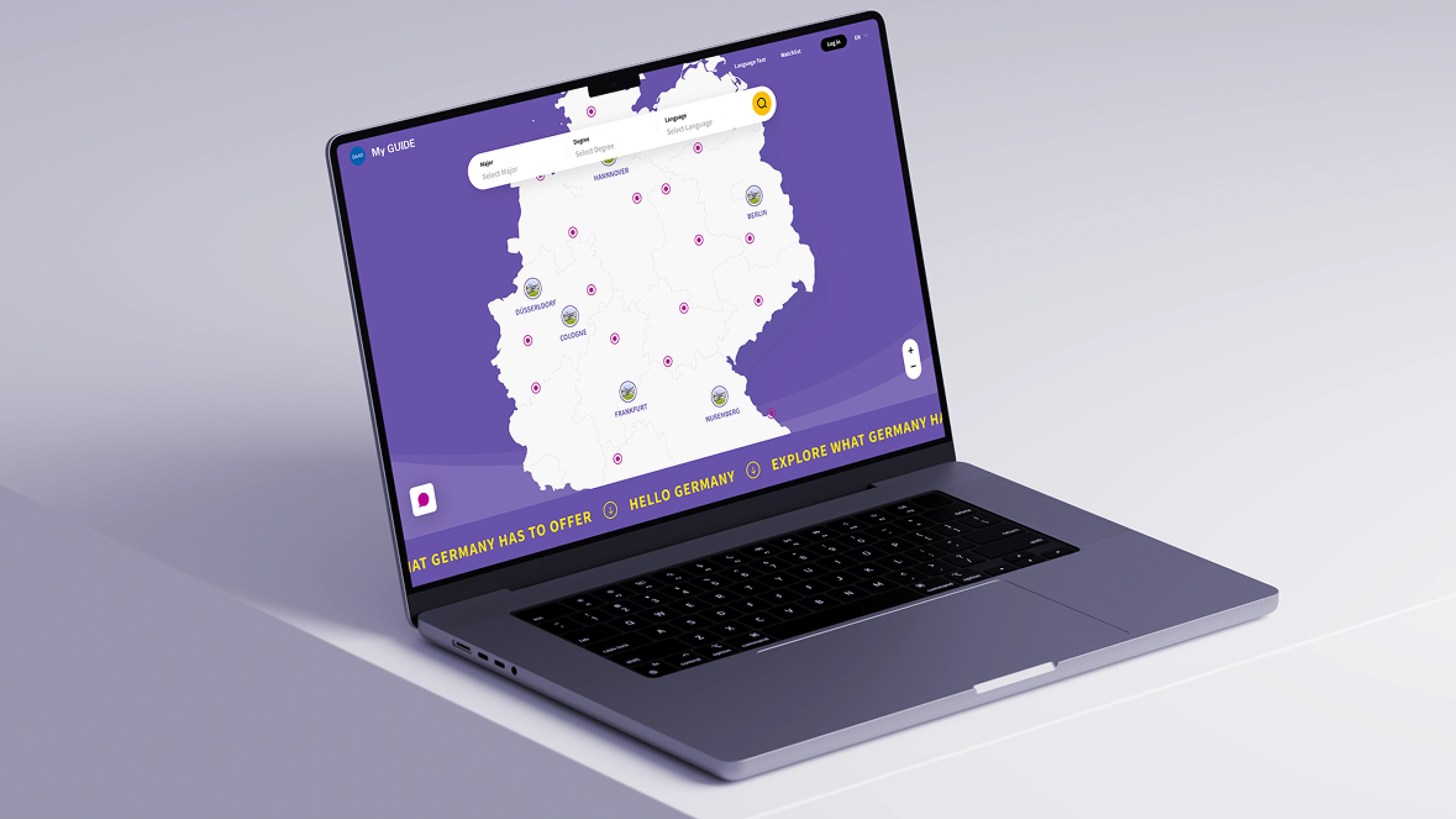
Interactive map as an invitation for exploring
At the center of the concept is a dynamic, interactive map of Germany that anchors the search for programs and universities. It combines filters such as degree type, subject, and language with visually rich, contextual information to create a natural entry point for exploration.
Designed for young, mobile users
We designed the experience cross-platform guided by the needs of a mobile-first, digital-native audience. On mobile, the experience centres around playful, intuitive discovery. Users swipe through visually rich info cards, layered over the interactive map, and explore university data in a lightweight, scroll-based journey. The desktop view supports more structured planning, with hover-based navigation, contextual tooltips, and a dynamic sidebar for layered, deeper exploration. Clear hierarchies and interaction cues guide users through a complex decision process without overload. On both platforms, the interactive map acts as a central orientation tool.

Highlights & Capabilities
Trusting the Process
The concept was developed through a combination of platform analysis, market and service benchmarking, and FLUID’s experience in designing digital products for complex use cases. Our next step would be to validate key assumptions through user research and usability testing in order to refine and optimize the concept based on real user needs.
The Whole Package
At FLUID, we offer everything from UX concept and navigation design across platforms to deep expertise in information architecture and interaction patterns. We combine our conceptual strength with experience developing and working within visual design systems.


Subscribe to our newsletter!

Copyright © FLUID Design GmbH — All rights reserved.