


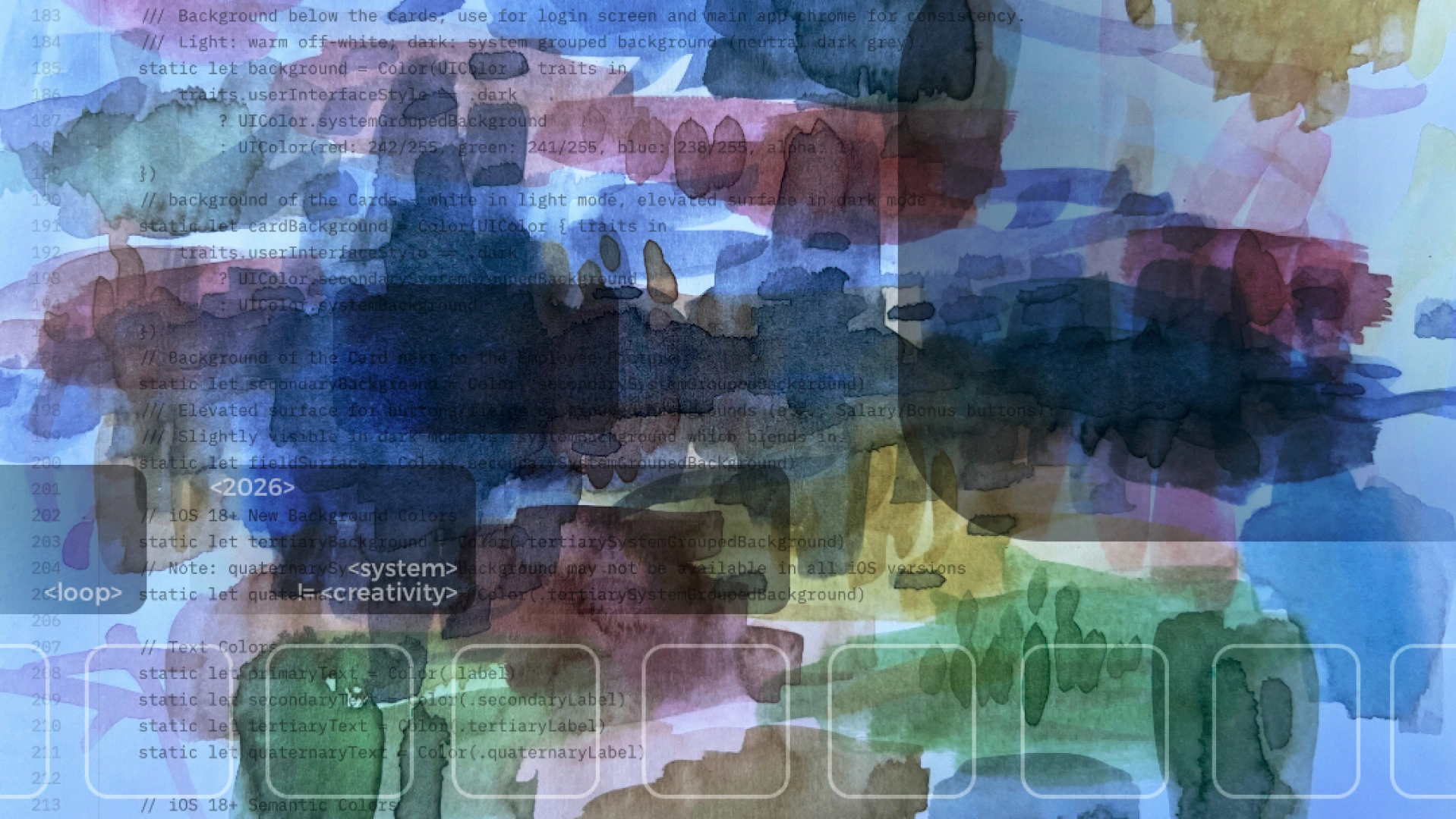
In the age of AI and vibe coding, one thing quietly gets lost in the conversation: strong visual design skills. The passion to explore. The drive to look sideways at brand, trends, fashion, architecture, art, and drag something new back into our own craft.
We talk endlessly about flawless UX. About smooth flows. About shipping fast. About design systems that keep everything consistent from Figma to production.
All good things. But somewhere in that optimisation, design has started to feel less like facing a white page and more like playing with existing Lego blocks. Reassemble, recombine, ship. Repeat.
And it is not just digital.
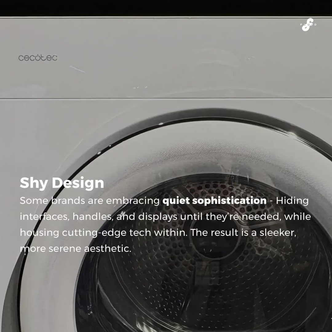
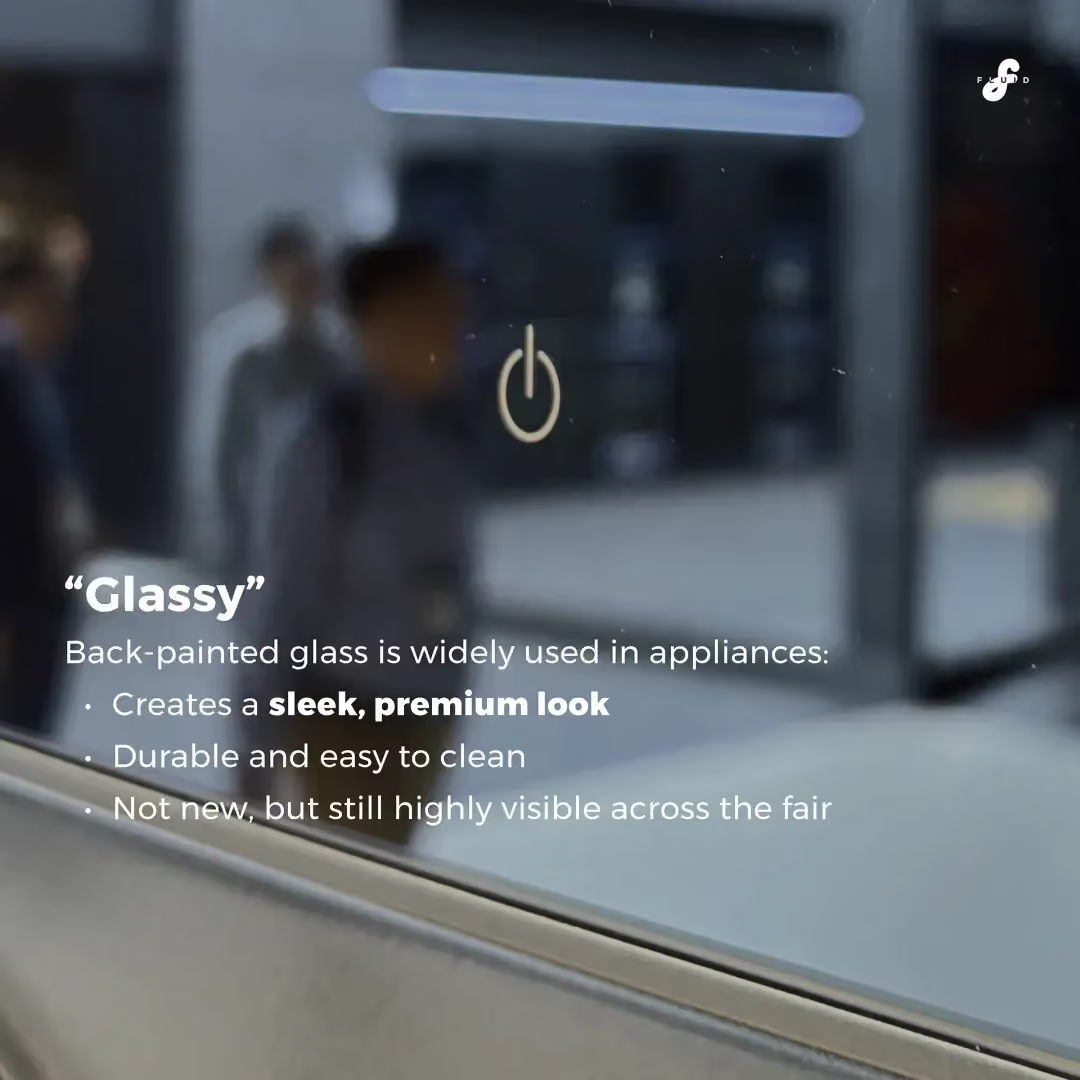
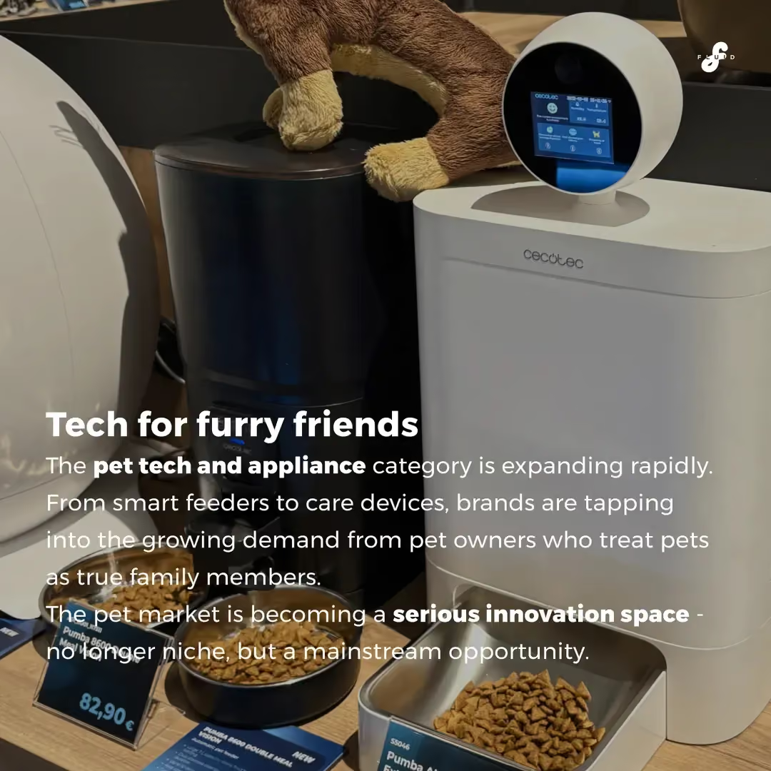
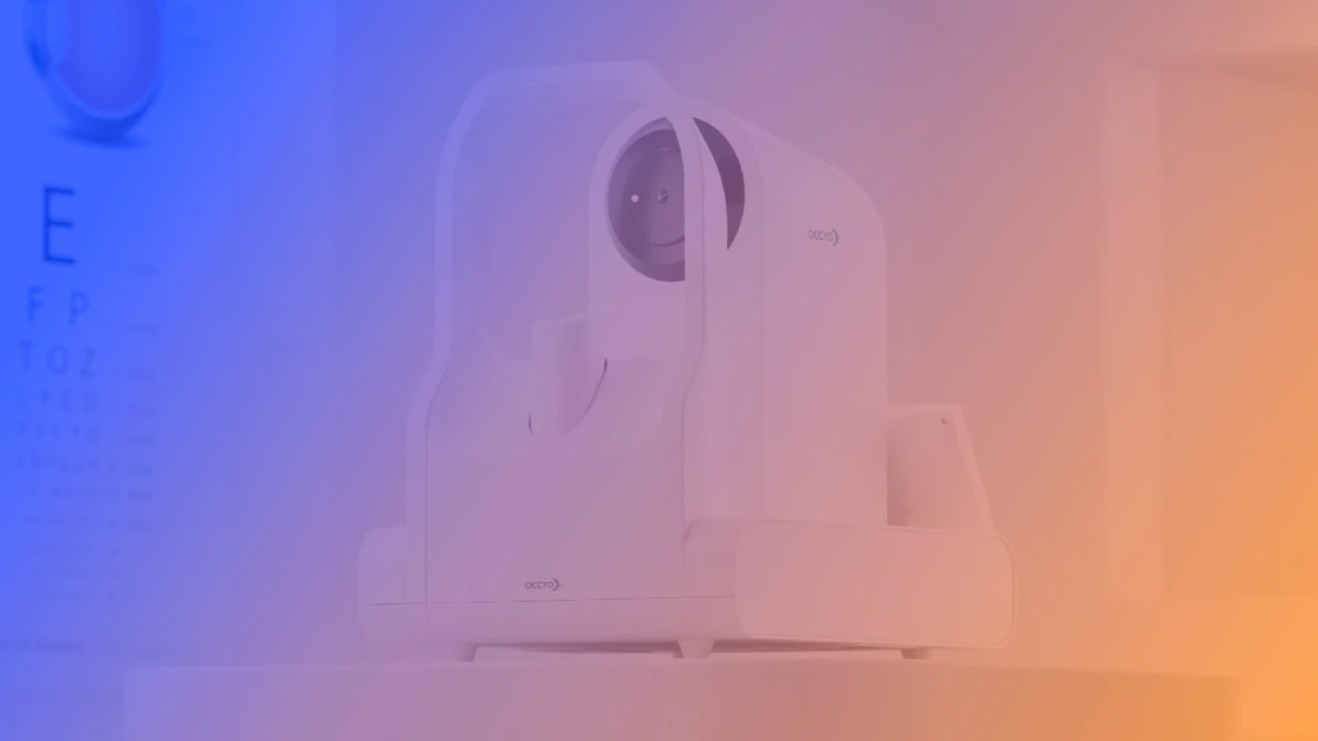
Look at industrial design right now: squircle shapes, soft whites, gentle radii, quiet surfaces. Products designed to be accepted, not questioned. Nothing too loud. Nothing too square. Nothing with edges you might actually rub against.
We have collectively drifted into a very safe visual middle.
And the next generation feels it first.
Historically, it was often the young designers who pushed for new directions. The ones with the passion, the openness, and a healthy dose of positive naivety to try something the rest of us would have talked ourselves out of.
Today, browsing the portfolios of people looking for the harder-to-find jobs in our industry, something else comes through: a certain lostness. And it is hard to blame them. The job descriptions ask for fluency in UX processes, deep user research, the ability to structure and distill it all, strategic thinking, written artefacts, design system craft, tool mastery, AI workflows, vibe coding. And, somewhere at the end of the list, still be visually strong, open, and explorative.
That is not a role. That is a stretch that borders on impossible.
Somewhere along the way, saying "I created something visually exciting" started to sound almost apologetic. As if visual excellence, without a 40-page strategy deck, a research audit, and a design system behind it, is somehow second-hand work. Just "only" beautiful. Just "only" bold.
I think we have that exactly backwards.
Because here is what AI changes.
As AI makes it easier and easier to arrive at good, solid, mainstream solutions that respect every constraint and integrate cleanly with every system, the baseline rises for everyone. Competent, well-behaved, on-brand output becomes the floor, not the ceiling.
What will differentiate exceptional design from good AI-assisted design is precisely the thing we have been quietly demoting: visual quality with an edge. Depth. Character. A point of view. Work that is not just a slightly better squircle.
That is what has a chance to grow on people. To last. To become a classic. To inspire the next wave to push further.
A small personal reminder of that: about ten years ago we did an exploration at FLUID into the design expression of fitness equipment for the home (link). At the time some of the directions felt edgy, maybe even a little strange. What has been quietly encouraging is that, a decade on, designers we deeply respect still bring it up as fresh and inspiring. Not because it was loud, but because it was allowed to have a point of view. That is really the only lesson I took from it: work with an edge tends to age differently than work built to please everyone on day one.
So a genuine question to the community, to designers, creatives, and the people who commission us:
Where are the ones pushing the boundaries right now? Which studios, which products, which brands, which people are stepping out of the visual limbo and heading toward new shores?
And if you are one of them: what gave you permission to leave the safe middle?
Even more importantly, how do we make room again for the young designers to be visually brave, before we drown them in everything else we now expect them to be?
Curious to hear what you are thinking.
Subscribe to our newsletter!

Copyright © FLUID Design GmbH — All rights reserved.